top of page

Knight in the cold air
This project was part of a painting tutorial for my digital art class which I then chose to complete. The tutorial was centered around doing a "Bob Ross" like background and as you can see it didn't quite stop there.

Covid Era student planner
Designing content for a highschool when your mascot is a phantom is tricky because you don't want parents to see your design as too scary. I felt this design rode that line going more for sorrow than fear. The skull-like mask has an obvious connotation to what was going on in our lives at the time while the yellow moon provided bright contrast to the somber purple.

The Mission Heights Phantom
When I got to MHP one year after it was opened the logo was a derivative of Phantom fireworks and looked like a scooby doo monster. I quickly set to trying to replace it. My first pass was like this but the logo was longer and the phantom was more slight. It honestly looked like the Nike swoosh and not in a good way. I later replaced it with this designwhich bulked up the phantom and compacted the character, making it more reminicient of Batman swooshing his cape. This has been the main logo since that time.

Wraith Planner Design
We used to put a lot of emphasis on physical planners in an attempt to get students to be more organized, and each year had a different design where typically I or one of my students would produce the design. In the year just prior to lockdowns I think I was playing Shadow of Mordor and that clearly had an impact on what I was thinking about at the time. The original had a cold-air breath effect but my boss felt that it looked like the phantom was smoking. Looking at it again now, I would also cut that glowy eye from it.

Phantom Esports Logo
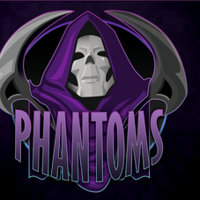
As the Esports coach for League of Legends I wanted a logo that was specific to that program. We were very successful and they were building a new classroom for me that would have a banner along the back wall. While I like a lot about this, I would rework the face given the chance. It looks too much like Skeletor from the Masters of the Universe film from the 80s.

Lady Phantoms Volleyball team Logo
I'm honestly pretty proud of this one. I think its clearly feminine without being overly sexualized, and it has dynamic movement with clean lines. I could have pushed the motion further to get a better silhouette, but thats hindsight for you. I'm not sure if they decided to use it or not, I haven't seen it around campus.

True Phantom
My assistant principal always wanted me to really show what I could do and didn't have the same hesitations as some of the other staff about being scary. He wanted something that would intimidate visiting teams and make our players feel bad ass. This was printed on the doors entering into our gym, and on the crash pads at either end. This is my favorite thing I've done for the school because to me it still feels like its moving from out of the abyss towards the viewer.

"Anchor" Splash Art
As a forever DM, its a rare thing when I get to actually make and play a character. This was my Duergar Rune Knight, "Anchor". I attempted to do a League of Legends-like splash art for him as part of a lesson for student in my digital art class.

White Dragon Attack
This was another "Bob Ross" tutorial that ended up getting more than I had originally intended it for.

Orc Girl
I was following the work of Aaron Blaise on YouTube and made a character using the method he was teaching. I ended up being pretty happy with this character, especially the colors.

Orc Girl: Full
Using a method taught by Aaron Blaise on his YouTube channel I painted this fantasy orc girl character. The yellow blob is the light color while the blue is the shadow color.

Texture Study
I love looking at texture studies from other artists on places like Pinterest, I just think they're neat. I made it an assignment for my digital art class and of course I needed to show them I could do it too. Ngl, some of theirs were at least as good as mine.

Cavanoir- Frazetta-esque
My father wrote a sci fi novel and I asked to have a crack at the cover. He drew a pencil version of this and I attempted to fix it up and present it according to what he wanted. He didn't end up going with it, so I lost a contract with my own father, lol.
bottom of page